I am very excited about this installment of "Before & After". The reasons I am excited for it are twofold (picture Chandler from "Friends" sticking his fingers up from a little hole in a big box...) First, we received a lot of feedback on our black and white images from New York, and some really good questions about how we get the look that we do. And that is exciting because we went to New York with the intention of shooting some nice Fine Art stuff. So I am excited to talk about that. Second, mastering black and white photography is something that takes a lot of work, and we are no where near masters yet, but we both really love it and we actually were talking on the plane ride to New York about how we want to go out and practice shooting with the intention of the images being black and white afterwards. So this area is one in which we are learning and growing so talking about it is exciting as it forces me to know my stuff even more!
The inspiration for this came from reading this month's Popular Photography magazine. On page 24 there is a fabulous article on black and white photography and some tips and things to practice to become better at it. We all know that Ansel Adams was practically a god of this type of imagery and he often talked about visualizing how you want a finished image to look in your mind before you even snap the shutter of your camera. That skill is even more important when you're shooting for black and white since the things that usually turn out great in color images can muddy up your shot in black and white. Have you ever been playing around in Photoshop and turned a great image from color to black and white only to feel like the image went from "POW" to "blah"? The difference between the two is all about tones, or degrees of brightness. Brightly colored flowers and green grass may evoke a joyful emotion in a colored image but may appear drab in a black and white if their tones all translate to the same shade of gray. Generally, images with high contrast and look much more striking when converted to black and white than those with lower contrast.
So, Nate and I decided that we would start practicing this different way of seeing. To look at a scene in degrees of brightness instead of colors. This is an interesting shift of thought and a fun challenge.
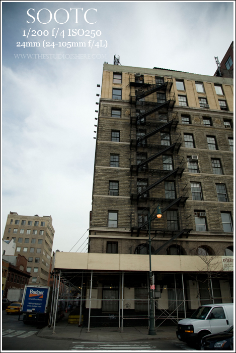
It's a good image. The bottom is a bit distracting though so I pulled it into Adobe Lightroom and cropped the angle to cut the street and cars out and also to draw the eye up to the building and the sky. Next I brought it into Photoshop and started playing...
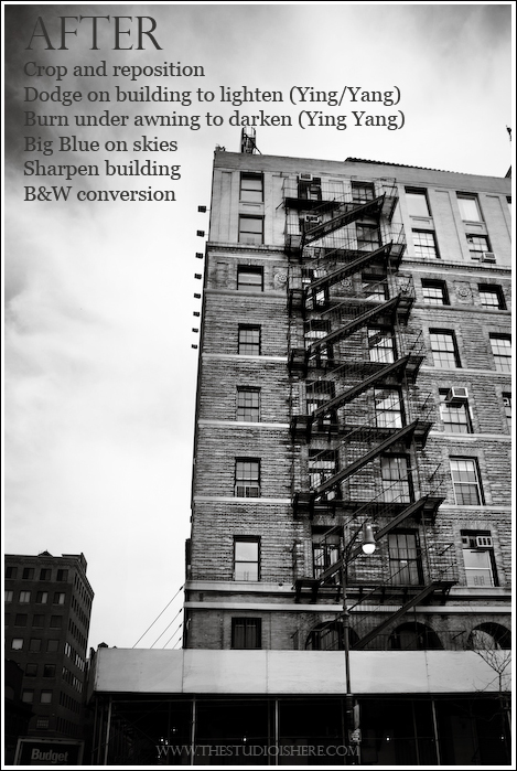
I primarily use actions from Totally Rad Actions so I talk about them a lot but you can create the same effects without them just using Photoshop's own tools. I used TRA's Ying/Yang to lighten the building and the staircase and to darken the area along the bottom and the building to the left. Then I used TRA's Big Blue to bring out the blue tones in the sky to create more contrast between them and the clouds so that when we converted to B&W they would stand out more. Next I sharpened the building and then ran our own warm black and white conversion on it.
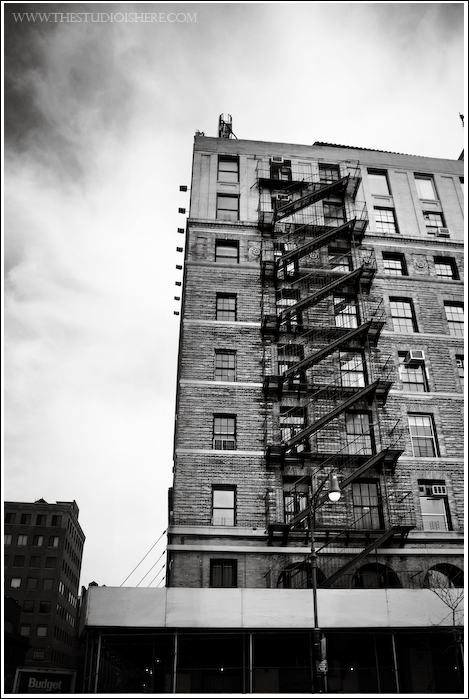
And now one more time without the writing on it...
We hope to continue to learn and grow in this area. There is just something magical about black and white images. They carry no emotions from the colors they include but instead create emotion based on their essence. They are just timeless. What are some of your favorite things about black and white images?


yay for before and afters!!!! they are my favorite!
Cool stuff! Thanks for the inspiration. :)